SnackThat: a personalized food delivery experience
SnackThat is a food delivery app that facilitates a personalized experience so that users can find the things they love faster. Being able to save their favorite restaurants and items helps them curate their own menu based on what they’ve enjoyed in the past.
My Role
UX Researcher - UX/UI Designer
Tools
Figma - Keynote - Notion
Methods
Wireframes, Functional Prototypes, Usability Tests, Secondary Research
Defining the Problem Space
Cutting through the noise
We are living in an age of algorithms, advertising, and noise. Many people are tired of this and are relieved when they find products that show them only the information they want to see, without all the promoted content and pop-ups. They want to be in control of the spaces they inhabit and want to know what to expect. Take a look at these popular food delivery services and it’s not hard to see why users might be overwhelmed and uncomfortable when ordering.
There are 27 clickable elements on the first screen of DoorDash and Instacart.
Ordering food is simply overwhelming.
Instacart
Grubhub
UberEats
DoorDash
How is SnackThat any different?
Competitive Analysis
These apps had no functionality to favorite specific items. Favoriting things in general was treated as an afterthought. This created a huge gap in the market for a product that prioritized a personalized and customizable experience.
What’s the impact?
Directed Storytelling Interviews
After asking representative users about their usage, needs, and frustrations with delivery apps they’ve used in the past, some common themes emerged. One of which was, whether they were searching for something specific or just browsing, purchasing grocery items or from restaurants, users favored familiarity with what was being ordered. When this wasn’t present, they felt confused, disappointed, and more likely to move to a different service.
“I searched for a very basic item, eggs for instance and I thought ‘it’ll be the store around the corner for sure, but no it’s this random store and they only sell a max of two eggs in their little two eggs cartons”
Understanding the Users
Response to Promoted Content
After finding gaps in feature sets of similar apps and finding out how users interacted with them, I wanted to find quantitative data to determine how different age groups used food delivery apps and how young people responded to promoted content to further confirm the need for a simple and customizable experience. I found that the younger the user, the more likely they were to have used a food delivery app in the past. Also, young people were more attentive and thus critical of advertising and more likely to have a negative reaction to it.
“60% of those aged 18-24 and 45% of those aged 25-34 use the [food delivery] apps at least once per month, compared to only 7% of those 55 and older.”
“[When browsing through apps], a number of the shelves felt clearly sponsored and therefore I ignored them.”
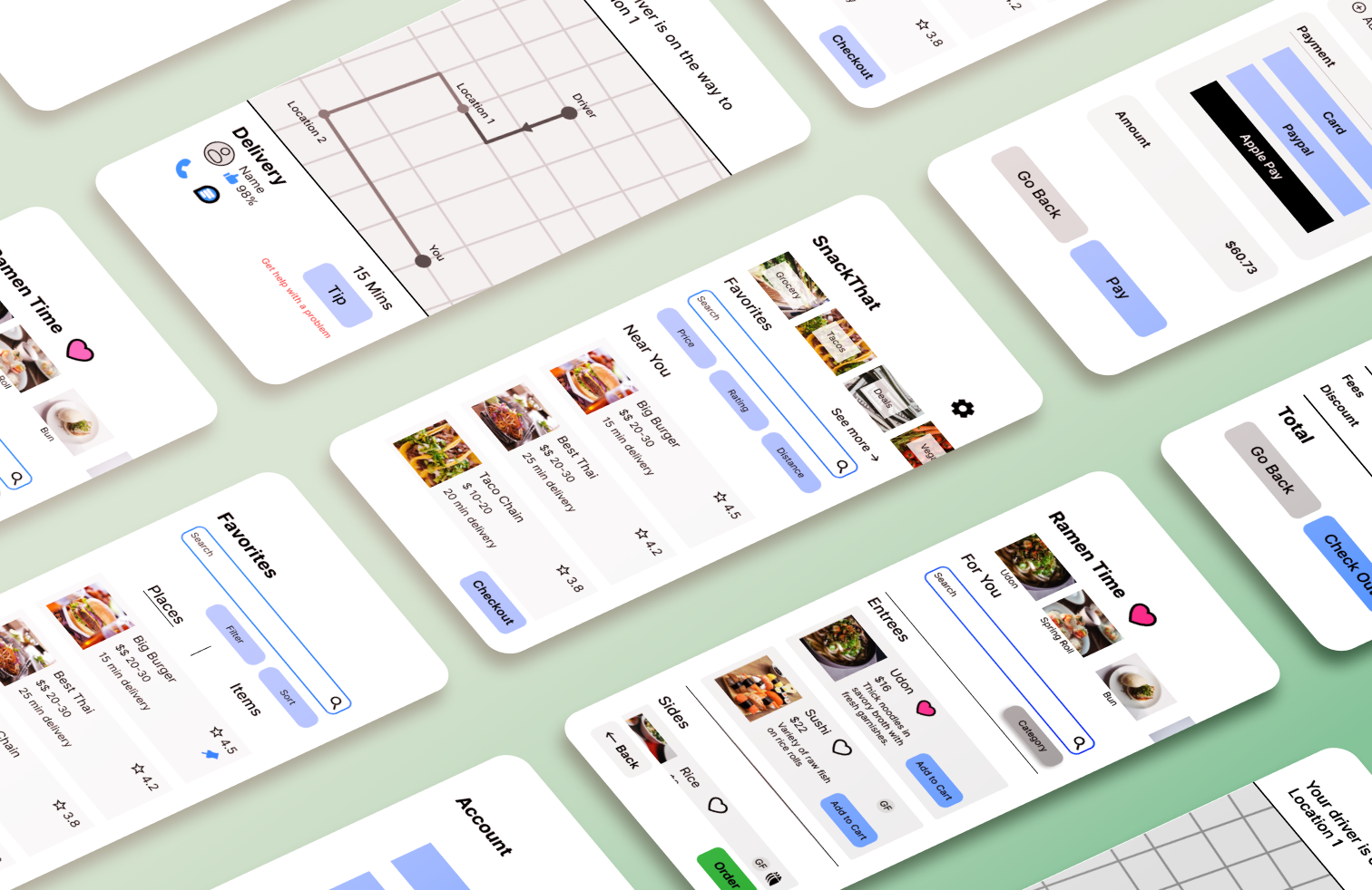
Bringing Concepts to Life
Ideation and Interactive Prototyping
I first created medium-fidelity sketched wireframes to get a better understanding of how the pages might look and how they might connect to each other. I also created an information architecture diagram to clearly define the hierarchy of screens.
Sketched Wireframe of Three Key Screens
Information Architecture Diagram
Next, I digitized my wireframes in Figma and added more detail and placeholder content as a first step towards creating an interactive prototype.
Lastly, I made these prototypes interactive to be utilized during usability testing. The main things I wanted to users to be able to test was navigating between the different screens, favoriting items and adding items to their cart.


Home Page & Favorites Screen
Vendor Screen & Checkout
Can Users Navigate Through the “Happy Path”?
Usability Testing
I conducted usability tests with the functional prototype to see if users were able to navigate through the key user flows related to favorites. During these tests I found that while users understood the idea and purpose of favorites, the homepage dashboard was confusing because of a lack of grouping clarity and poor placeholder content choices. Also the choice of a star icon for the favorites button was too ambiguous in meaning.
To convey how elements of the dashboard are related, I created an isolated section for the Favorites content and made the Favorites title into a button.
Home Page
Favorites
In my original design, I had used a star icon to indicate both the user rating of an item and the ability to favorite an item. This inconsistency was confusing for users and I opted to turn the favorite star into a heart.
To improve clarity of “Add” button labeling, I changed “Add” to “Add to Cart”.
Lastly, I moved the heart closer to the name of the restaurant to more naturally indicate what is being favorited


Before
After
What I Learned
Planning is Paramount
The main element that users struggled with was the top Home Screen dashboard that showed Favorites elements. I believe that if I had spent more time creating a style guide as a foundation to make future design decisions based on, I could have avoided problems like this. For example, during wireframe sketches, I drew them as medium-fidelity instead of low-fidelity so my ability to create clear differentiations between sections was inhibited.
Pivots are normal
The main focus or problem that I was working to fix seemed to shift somewhat throughout the project based on the different stages of research and testing that I was doing, so I believe that doing more User Needs research, more secondary research and more rounds of usability testing was needed to come to a meaningful set of insights that could lead to a competitive and unique product.
How to Interview
During the entire process I was paying attention to not only what I was doing but how I was doing it. During the Directed Storytelling and Usability Tests, I tried to take notes and realized that I wasn’t able to focus on either my note-taking or my interview responsibilities. I found that my preferred workflow is to record the sessions and go back to create a transcript of the entire interview including what the person is noticing, doing, saying, thinking and feeling. In the future, I would like to take these insights and group them visually on colored sticky notes so that I can quickly scan for similarities and differences. In my current workflow, I was scanning the document I had created and listing the insights at the bottom in common groups which felt inefficient.
Next Case Study: Lucid Athlete
Maximizing impact on a budget