Lucid Athlete
Lucid is a fitness tracking app that integrates seamlessly with the Apple watch, giving users actionable insights and useful at-a-glance stats. There are over 100 million Apple watch owners, but the Apple Health app doesn’t give the same kind of top-of-line experience that the actual hardware is capable of. Lucid seeks to take advantage of the accuracy of Apple Watch’s biometric data capture and give endurance athletes an app that rivals that of Whoop or Garmin without having to buy another wearable.
My Role
UX Researcher - UX/UI Designer
Tools
Figma, Notion
Methods
Comparative Analysis, User Journey mapping, Rapid Prototyping, Tech Scoping, Kano Analysis
Defining the Problem Space
Everything all at once
“I don’t know what it means and I don’t know what to do with it.”
Popular wearable brands do a great job of packing as much detail into their apps as possible. But therein lies the issue: companies like Whoop and Garmin attempt to please everyone by allowing you to track a seemingly unlimited amount of metrics. They try to turn these into insights but because such a wide net is being cast, these numbers can often feel like gimmicks without any proof of actual meaning.
Garmin App Stress Score
Whoop Home Screen
On the other hand, the native fitness tracking app for the Apple Watch takes in a similarly endless amount of information but makes almost no attempt to communicate any meaningful context to the user. Health throws Apple users into the deep end without a paddle, telling them to figure it out themselves.
Health App Home Screen
Health App Browse Screen
“I find it a little cumbersome to navigate through all its features, nothing really blows me away about it.”
Who are the users?
A built-in market
Lucid’s goal is to fill this niche gap in the market by catering to endurance athletes who already have an Apple Watch, don’t want to buy another wearable, but still want best-in-class biometrics and actionable insights that the native Health app isn’t able to provide. These users also want to be able to trust that the information they’re being shown is accurate and generally will only track a few things at once. They just want to see that number go up.
To assist in anticipating the actions, touch points, feelings and pain points that a primary user might encounter in a typical experience, a journey map can be created that visualizes each step of the process and the things that might influence them.
Plotting out and detailing each step forced me to consider needs and pain points that I may not have thought about otherwise. For example, how an athlete preparing for a race might need to adjust their training regime or what metrics they’re tracking in accordance with the ramp and taper that is necessary to be as ready as possible for the event. The key takeaway from this journey map was that flexibility and customizability appeared to be a very attractive aspect for the primary user group. It helped during the user’s product choosing process to know that the app would let them see what they wanted to see if they didn’t like the initial layout. It was also beneficial for modifications of their training later on in their experience.
Iteration & Evaluation
Desirability Survey
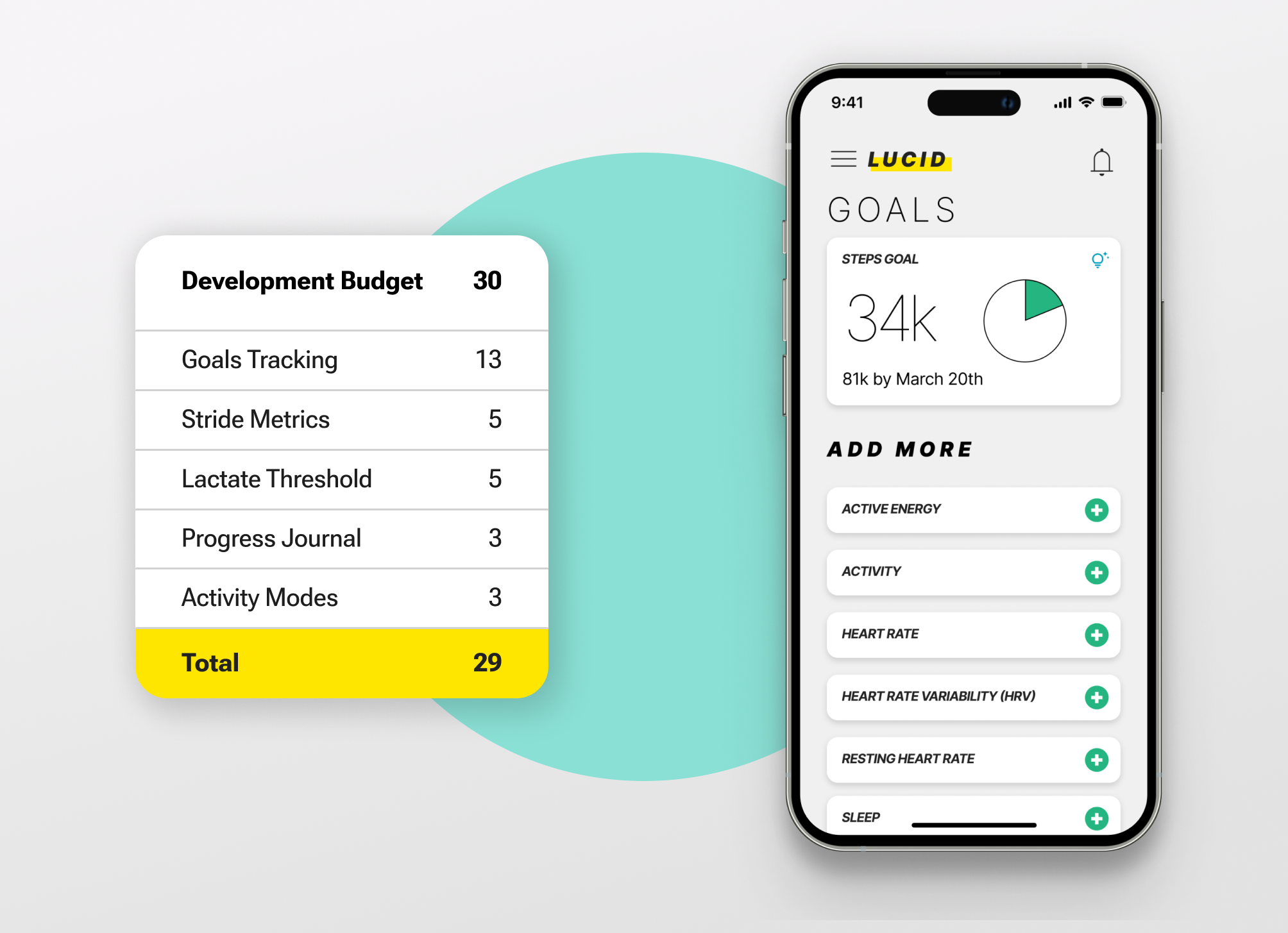
After taking a closer look into the current user experience and ways that it could be improved, my team and I did rapid feature prototyping to generate as many ideas as possible in a short amount of time. We then took these to the Lucid team and established a development cost for each feature and agreed on 30 points as a development budget for their next sprint.
We then picked 13 features to run through a Kano Analysis survey. A fair number of these features were well-received, but only choosing based on desirability wouldn’t have made economical use of the frameworks set up by some of the more expensive features.
Kano Analysis Table
I first picked the goal tracking feature because of its extremely favorable result with nearly all the participants saying they would like it, as well as half of those saying they would tolerate it if it was absent. The rest of the features were chosen based on desirability and making use of the frameworks that were set up by the goal tracking feature, including adding user input and a data cache. The other features chosen were Stride Metrics, Lactate Threshold, Progress Journaling, and User Modes.
Feature Recommendations
Below are the key wireframes of these features with annotations to describe functionality.
Next Steps & Learnings
Feature Testing
The only feature I chose that wasn’t a part of the Kano analysis was the User Modes feature. It was something I had thought of early on in the process after doing an initial stakeholder interview. I felt it was one possible solution to a triathlon athlete having multiple disciplines and wanting to track all of them. I received positive feedback about it from people I had talked to including one endurance runner, but if I were to keep working on this project, I would like to get some desirability data on it to see if my thoughts were confirmed.
Secondary Research
One difficulty with the development of these features was my lack of familiarity with the subject matter. Because I don’t have any experience with being an endurance athlete, I spent a lot of time just trying to understand industry terms and biological concepts. Things like VO2 Max and Heart Rate Variability needed to be understood (at least at a base level) before I could make decisions about how and when to use them. I think I should’ve leaned into learning these concepts even more and specifically which ones athletes paid attention to. This would’ve helped with the rapid prototyping stage, being able to focus in more on the features that users would actually care about.
chatGPT Prompting
I also had a hard time putting together the user journey map. We didn’t have time to do directed storytelling interviews, which probably would’ve been the most direct path to getting the needed information for it. I had to turn towards secondary research to find anecdotes about how endurance athletes trained, but I wasn’t sure how to search for it. Later on, someone suggested using chatGPT to generate some ideas on this topic. I didn’t specifically use any of the responses from chatGPT in my user journey map but it was helpful in giving me keywords and ideas to search for. Learning which problems AI is particularly adept in assisting with is a skill in and of itself, one that I believe is extremely valuable to practice.
Click here to view the complete Feature Recommendation Report